Dosaclub
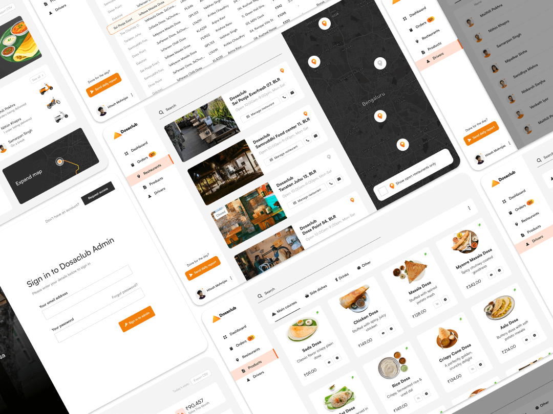
Dosaclub Dashboard
User Interface | Visual Identity
Context
Dosaclub is a food delivery concept focused on making different varieties of dosa available from nearby restaurants, delivered directly to customers. Along with dosas, the platform also includes side dishes, drinks, and other items.
This project focused on designing an internal admin dashboard used to manage the operational side of the platform. It was a self-initiated project created to explore how complex, real-time workflows in food delivery systems could be handled through a clear and structured interface.
This project focused on designing an internal admin dashboard used to manage the operational side of the platform. It was a self-initiated project created to explore how complex, real-time workflows in food delivery systems could be handled through a clear and structured interface.
The Problem
Food delivery operations involve multiple moving parts working at the same time. Admin teams need to monitor orders, manage restaurants, track drivers, update product availability, and review sales performance, often under time pressure.
Without a well-structured system, this kind of work can quickly become fragmented and error-prone. The challenge was to design a dashboard that could support real-time decision-making while keeping the experience clear, predictable, and easy to navigate for internal users.
Without a well-structured system, this kind of work can quickly become fragmented and error-prone. The challenge was to design a dashboard that could support real-time decision-making while keeping the experience clear, predictable, and easy to navigate for internal users.
Users & Operational Needs
Project Duration: 12 Days
On a daily basis, they needed to:
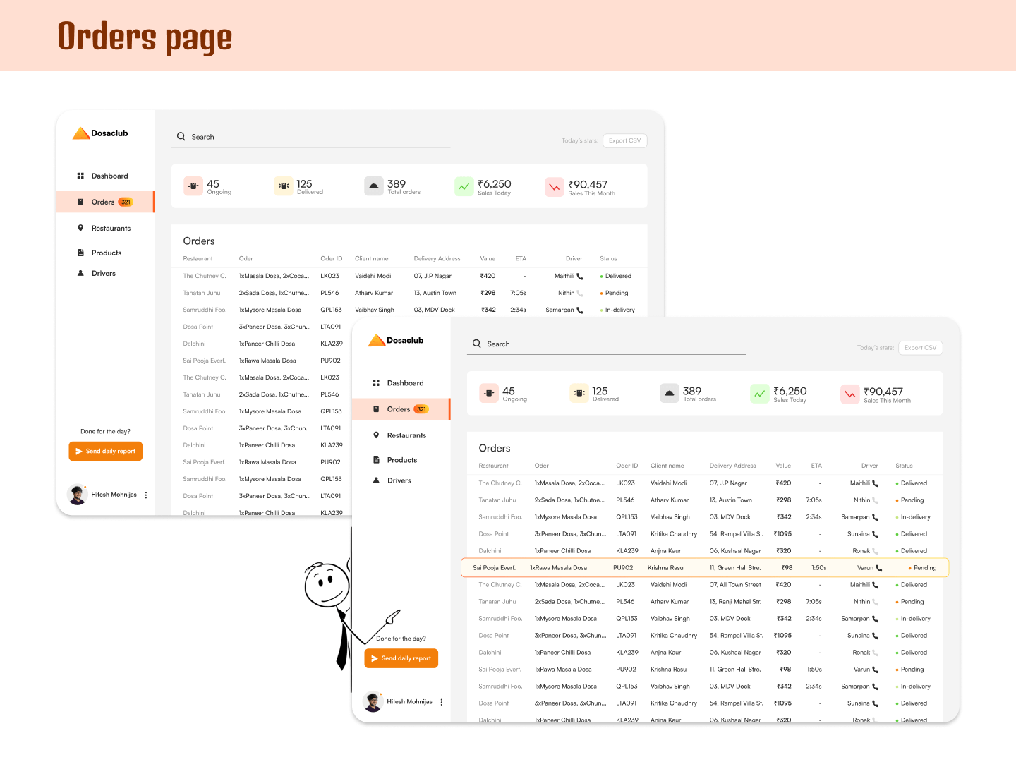
Monitor orders from placement to delivery
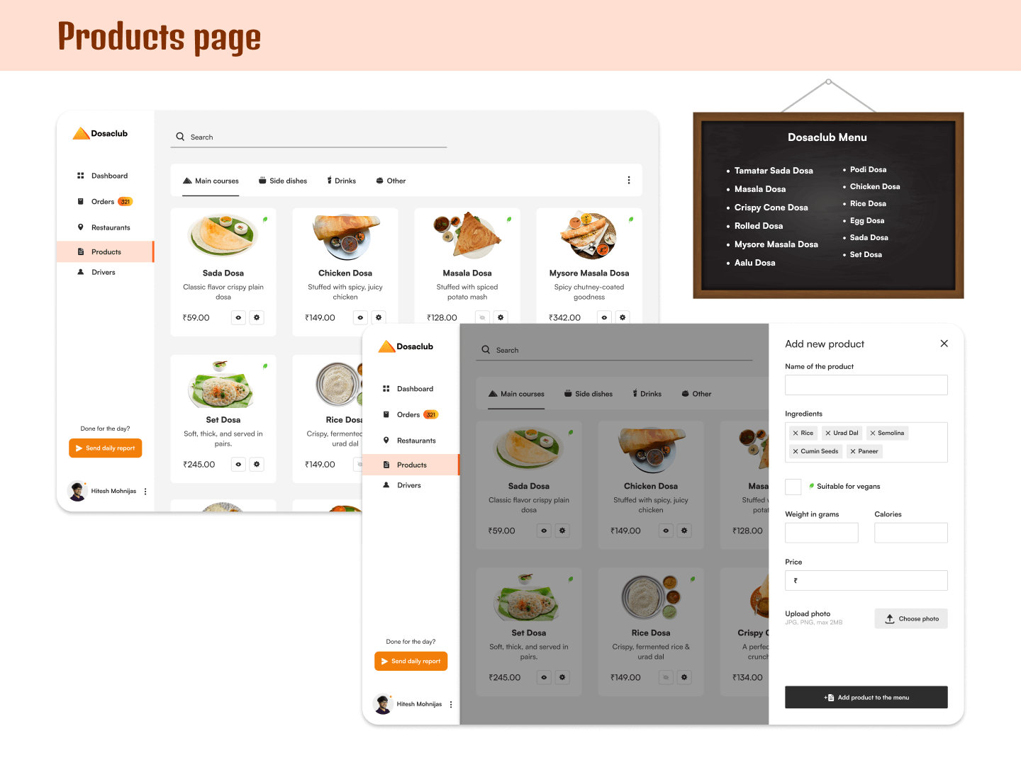
Manage product availability based on stock and service areas
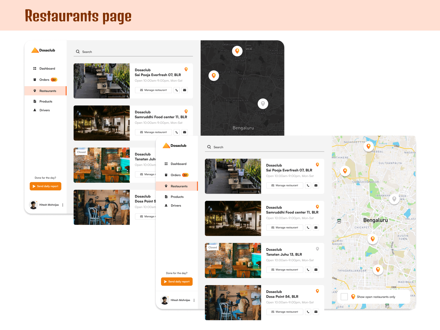
Add, remove, or manage restaurants on the platform
Review sales performance across different time ranges
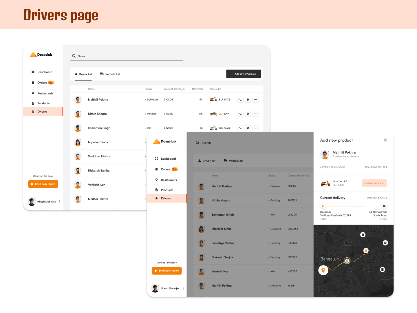
Track driver locations and delivery progress
Export daily reports for sharing with the team
Design Approach
I approached the dashboard as a system of interconnected workflows, rather than a set of individual screens. The goal was to reduce cognitive load by making information easy to scan and actions easy to take.
Key decisions included:
Structuring the dashboard into clearly defined sections such as Orders, Restaurants, Drivers, Products, and Sales
Using consistent layouts and interaction patterns so admins could quickly understand how each section worked
Prioritizing information based on urgency and frequency of use
Structuring the dashboard into clearly defined sections such as Orders, Restaurants, Drivers, Products, and Sales
Using consistent layouts and interaction patterns so admins could quickly understand how each section worked
Prioritizing information based on urgency and frequency of use
Key Design Decisions
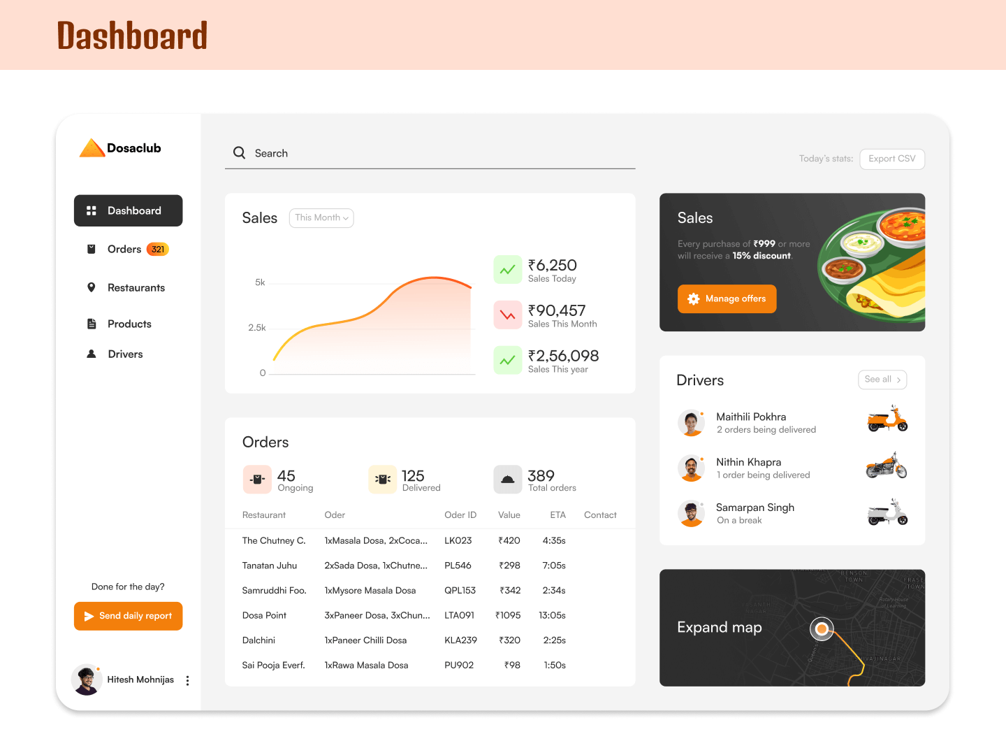
Live driver tracking allowed admins to see the exact location of drivers, active delivery paths, and assigned orders at a glance
Status-based color cues were used so availability could be understood instantly, such as different vehicle colors for active and inactive drivers
Sales overview visuals made it easy to check performance using a clean graph, supported by quick-view summaries for today, this month, and this year
One-click restaurant insights allowed admins to view open restaurants in specific areas without navigating through multiple screens
Smart product listings emphasized clarity by pairing clear imagery, pricing, and simple visual indicators like vegetarian icons
Constraints & Tradeoffs
Although this was a self-initiated project, it was designed with realistic constraints in mind:
Multiple workflows had to coexist without overwhelming the interface
Information density needed to stay manageable across different sections
Visual consistency had to be maintained while allowing sections to feel distinct
Reporting features needed to support real operational use, such as exporting CSV files
Outcome & Learnings
The final dashboard design presented a structured and cohesive system for managing DosaClub’s operations. Each section supported a specific operational task while contributing to a predictable overall experience.
How designing internal tools is more about efficiency and clarity than visual polish
How to prioritize information based on what needs attention first and what can come later
How small visual cues, like color and status indicators, can make complex information easier to scan
How thinking in systems helps when multiple workflows need to work together
How everyday operational decisions can be supported through thoughtful layout and hierarchy
Let's work together!
If you’ve get a story that needs to be told, get in touch
ishauptodesign@gmail.com