Gadgetgrab
Gadgetgrab project
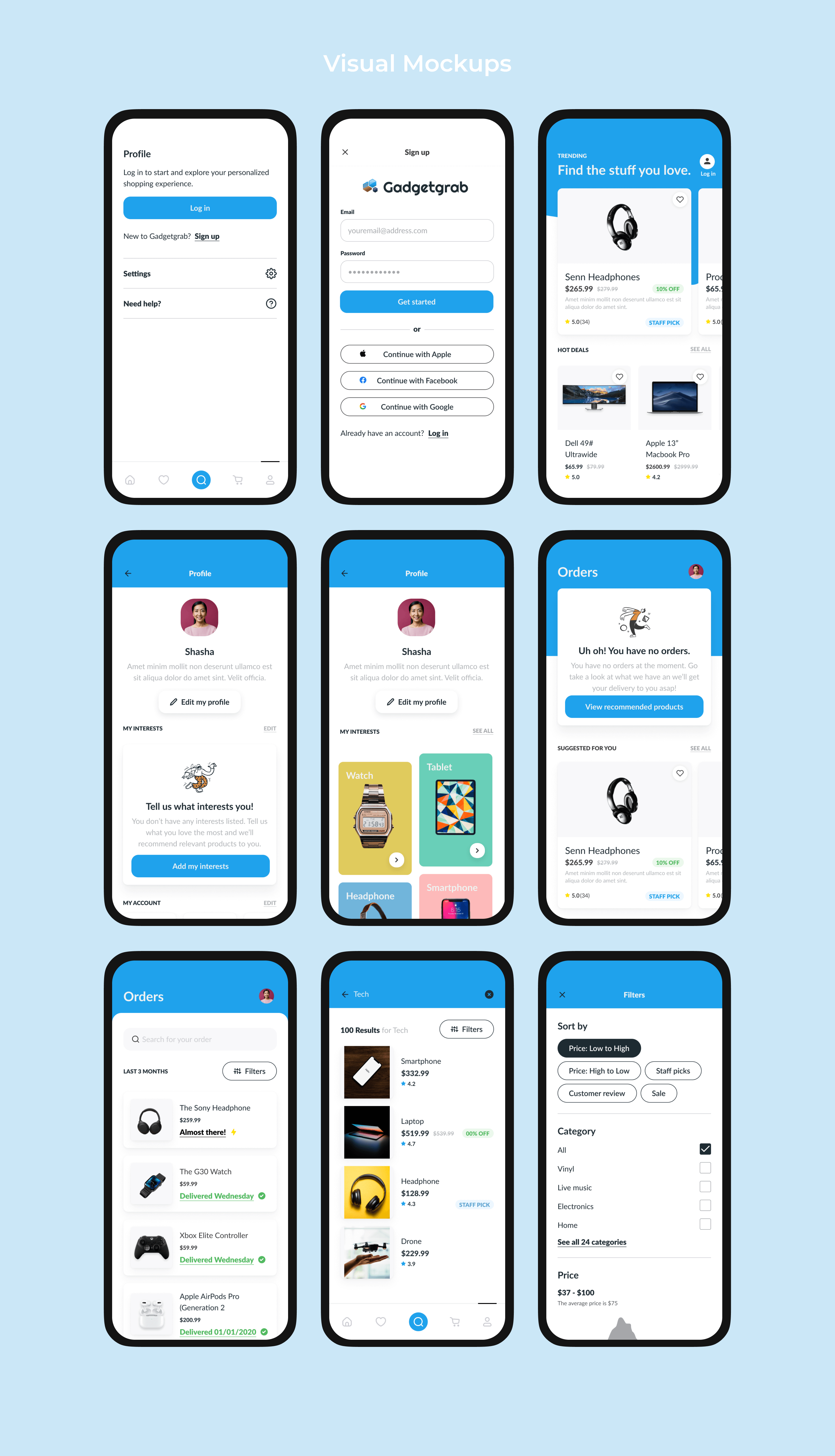
App Design
Context
Gadgetgrab is a self-initiated mobile app concept designed for purchasing electronic gadgets, from TVs and mobile phones to accessories like watches and extensions. The idea behind the app was to create a single place where users could explore and buy tech products without being distracted by non-relevant categories.
The project was created as a way to practice designing a real-world e-commerce experience while focusing on clarity, simplicity, and fast decision-making.
The project was created as a way to practice designing a real-world e-commerce experience while focusing on clarity, simplicity, and fast decision-making.
The Problem
Buying tech products online often requires users to jump between multiple apps and platforms to compare prices, check availability, and confirm whether a product meets their needs. This process is time-consuming and can feel overwhelming, especially when new products are released frequently.
Buying tech products online often requires users to jump between multiple apps and platforms to compare prices, check availability, and confirm whether a product meets their needs. This process is time-consuming and can feel overwhelming, especially when new products are released frequently.
The challenge was to design an experience that:
Reduced the time spent comparing across platforms
Helped users feel confident about their purchase decisions
Kept the interface focused only on tech products
Users & Goals
Discover new tech products as soon as they launch
Feel confident that the product matched their needs
Compare prices and specifications quickly
Complete purchases without unnecessary steps
Feel confident that the product matched their needs
Compare prices and specifications quickly
Complete purchases without unnecessary steps
Design Approach
The core design decision was to limit the scope of the product intentionally. Instead of trying to become a general marketplace, Gadgetgrab focused only on tech-related products.
Clear navigation and search
Clean product presentation
A simple and familiar buying flow
Clear navigation and search
Clean product presentation
A simple and familiar buying flow
Key Design Decisions
Focused product categories
Only tech-related items were included, reducing cognitive load and keeping browsing purposeful.
Clear product information hierarchy
Product pages were designed to show detailed descriptions, specifications, and pricing clearly, helping users understand what they were buying without switching apps.
Price awareness and timing
Users could view the average price of a product and decide whether to buy immediately or wait, supporting more informed decisions.
Simple purchase flow
The checkout experience followed a straightforward sequence: product selection, add to cart, address details, and checkout, with no unnecessary interruptions.
Minimal visual language
A clean white and blue color palette was used to create a sense of trust and calm, while keeping the interface light and easy to scan.
Readable typography
Lato was chosen for its clarity and modern feel, supporting readability across product listings and detailed descriptions.Readable typography Lato was chosen for its clarity and modern feel, supporting readability across product listings and detailed descriptions.
Outcome & Learnings
The final design resulted in a clean and focused shopping experience that allowed users to explore, compare, and purchase tech products without distraction. By narrowing the scope and simplifying the interface, the app supported faster decision-making and reduced friction in the buying process.
Through this project, I learned:
How narrowing the scope of a product can make decisions faster for users
How clear product details help users trust what they are buying
How structuring information well reduces the need for extra steps
How a simple buying flow can support quicker purchases
Working on Gadgetgrab helped me understand how small layout and flow decisions can have a big impact on how smoothly users move through an e-commerce app, especially when speed and clarity matter.
Let's work together!
If you’ve get a story that needs to be told, get in touch
ishauptodesign@gmail.com